As a graphic design professional for the past decade I am here to hopefully help you overwhelm your patrons a little less, and capture their interest more.

Imagine I have a big basket of ping pong balls and I throw them to you one at a time slowly so that they are easy to catch. If I then throw four balls at once, or eight, or twenty, it becomes impossible to catch more than a couple, and your attention will be split in multiple directions as you attempt to grab even a few.
Now imagine those ping pong balls are little packets of communication, and you will understand how graphic design works at a basic level. We understand this because we know that websites with too many pop-ups, banner ads, and flashing buttons overwhelm us – and that billboards with too-long headlines illicit confusion. Impactful simplicity such as Nike and Apple (pre-mouse charger, anyway) is effective because well-crafted design is reassuring and allows our brains to take semiotic shortcuts and not scrabble for understanding.
Whether creating an event poster, a snazzy cover for a grant proposal, or simply posting a Canva graphic to social media, we are engaging in this act of throwing information at the viewer.
As a graphic design professional for the past decade I am here to hopefully help you overwhelm your patrons a little less, and capture their interest more.
Help yourself be heard.
Ask yourself the following:
- What am I trying to communicate?
- What is the most important thing to know?
- Who is the most important person for this message to reach?
These seem like no-brainer questions but a frequent refrain I hear from design clients is that their offering is for everyone, which is rarely ever true. People have preferences and interests even for the most everyday and mundane things such as whether their toilet paper comes with a fluffy kitten on it. And thinking more critically about who you are talking to can reveal blindspots or shallow assumptions. Consider, when communicating a kid-centric event are you marketing directly to children or are you actually targeting their parents and guardians?
Think of your library communications as an elevator pitch where you only have a very small window to make an impression before being dismissed as another annoying advertisement in the static. By narrowing down your goal to communicating a simple hard-hitting message to a smaller audience of patrons, you will increase the chances of that message making it through the thick fog of messages competing for that person’s attention.
This is me encouraging you to be a little bit of a copy-cat.
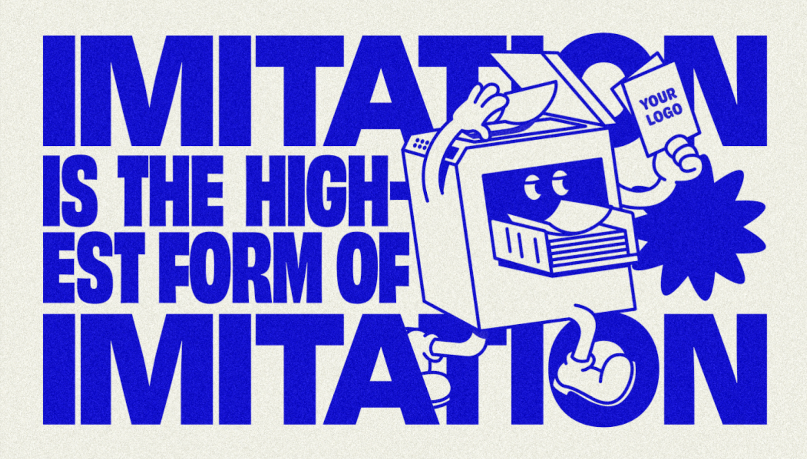
The best way to learn is by doing, so run over to your nearest free design program (GIMP or Figma or Canva are all great) and make something fun today. Imitate a design you like just to learn from it. I don’t mean copy exactly, but take inspiration from others and notice why it is working or not working. Musicians learn by doing covers of other music, so why not you?
For the low price of free.
Free software makes design increasingly accessible, and much like the advent of the printing press this allows underrepresented voices to use the visual language of design to shake things up and project an otherwise unheard perspective. Am I implying that your book club promos could be incredibly provocative and political? Maybe??
I like to keep a stash of free stuff so here’s a peek inside my bookmarks folder: ClipArt ETC offers old timey etching illustrations, Icons8 offers free illustrations with credit, and for images you might have heard of Pexels, Unsplash, and PixaBay, among others. If you’re keen for a specific image try searching for rights-free images through search filters on Flickr or Google images – there’s a lot of creative commons content out there if you know where to find it.
As for fonts, there are many articles outlining where to find great resources like this one, but you can’t go wrong with Google Fonts in a pinch. Also, on sites like Creative Market fonts can sometimes be as little as $8 and if the font is truly working very hard for you and gives your posters and social media posts some clean consistency then it is probably worth it.
Check your work.
Legibility
Consider if those with colour blindness or impaired vision can read your poster. A fun trick is taking a picture and turning it to black and white to see if you’ve got decent contrast, as certain colour combinations will just turn into one block of grey.
Language
Is your writing understandable for someone who is less literate? Is it confusing or are you assuming the reader has a certain level of knowledge to figure it out? Also: why waste time say lot word when few do trick? Shorter headlines are able to be much bigger in a layout, so embrace brevity and shout your workshop/event/book club from the rooftops.
Hierarchy
In your communications what do patrons look at first, second, last, and is that the order you want them to read it in? If you’ve ever read Japanese manga you’ll notice that they often maintain the top-right-to-bottom-left reading order that is sometimes awkward for English-speaking readers to switch over to because our top-left-to-bottom-right understanding of reading is so ingrained. Use that cultural familiarity to your advantage and create a logical journey for the eyes.
Impact
How did you do? Did people react well to your communications? Conversationally ask patrons if they saw your Instagram post or your poster and what they think of it and how it might improve.
Good luck and have fun.
As your familiarity with a design program grows and your taste and eye for design improves, you’ll be amazed at how effective design can be when used to further your library’s goals. Remember that developing these skills doesn’t happen overnight, but that with good intentions and a bit of planning and practice you’ll be well on your way.
Lyndsay Wasko is an online MLIS student at the University of Alberta with an undergraduate degree in Communication Design from the Alberta University of the Arts. Outside of school she works as a designer and illustrator at Daughter Creative, where her work has been internationally recognized in Applied Arts and Communication Arts publications. In 2020 she was selected as Calgary Public Library’s Children’s Illustrator in Residence which inspired her to pursue an MLIS degree. In her spare time Lyndsay enjoys long YouTube video essays, D&D, and generally aspires to the life of a Beatrix Potter animal: baking, sewing, gardening, and exploring nature. Learn more about Lyndsay at https://linktr.ee/lyndsaywasko.
FEATURE IMAGE: LYNDSAY WASKO | INSET Image credit: elliotisacoolguy | GIF credit: Blades of Glory (2007)
Categories: advice, Professional Life, tools
